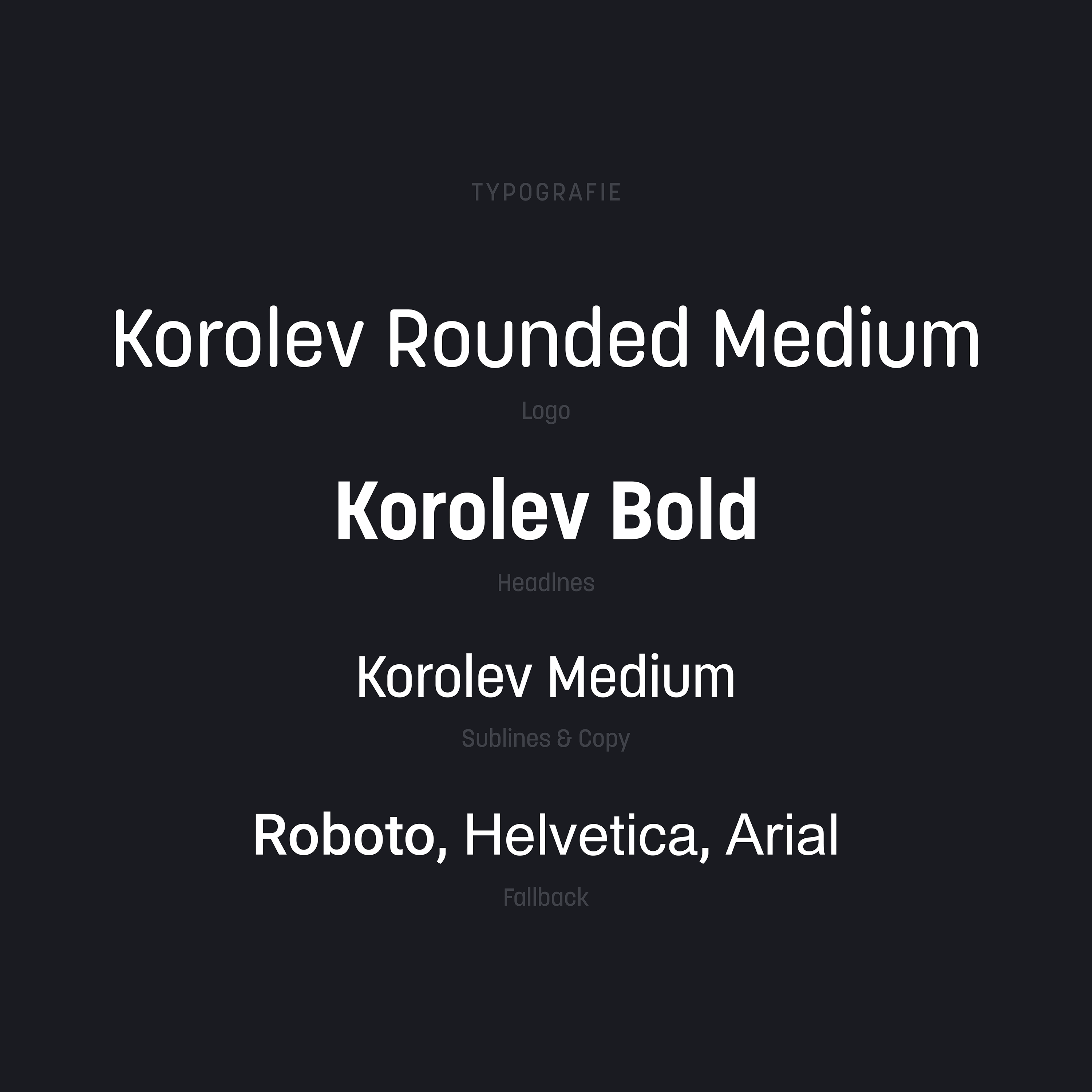
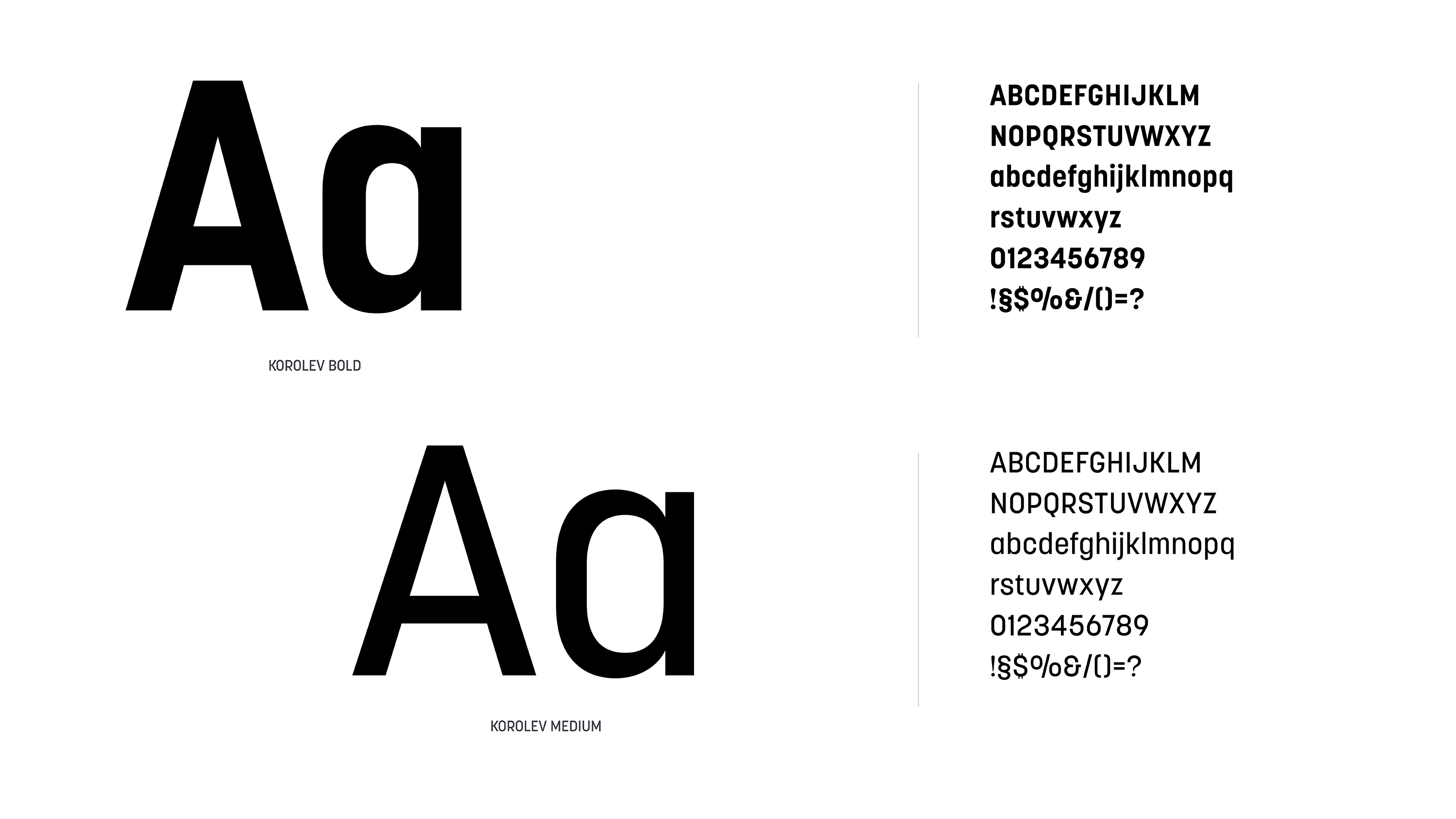
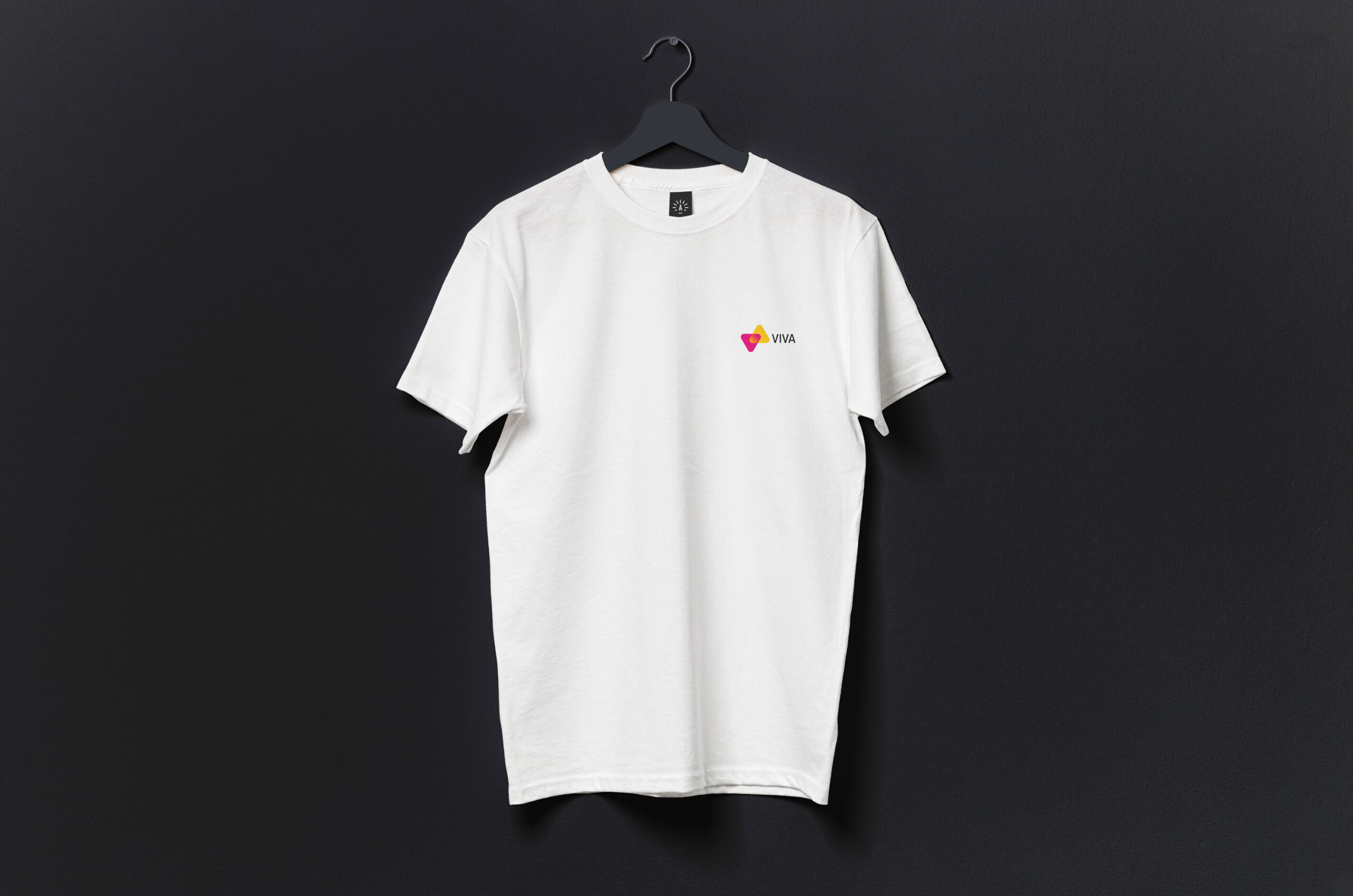
With courage, respect and wisdom in mind, we created a purposeful meaning that permeates throughout the design elements. The logo, a joyful reminder of how the union of all parts creates a stronger whole. THE VIBRANT COLOR GRADIENTS GIVE THE BRAND’S DESIGN ITS DISTINCTIVE APPEARANCE, WHILE GIVING IT A NOD TO ITS PAST.


| Cookie | Dauer | Beschreibung |
|---|---|---|
| _ga | 2 years | This cookie is installed by Google Analytics. The cookie is used to calculate visitor, session, campaign data and keep track of site usage for the site's analytics report. The cookies store information anonymously and assign a randomly generated number to identify unique visitors. |
| _gid | 1 day | This cookie is installed by Google Analytics. The cookie is used to store information of how visitors use a website and helps in creating an analytics report of how the website is doing. The data collected including the number visitors, the source where they have come from, and the pages visted in an anonymous form. |
| Cookie | Dauer | Beschreibung |
|---|---|---|
| _gat_gtag_UA_93373341_1 | 1 minute | No description |
| cookielawinfo-checkbox-functional | 1 year | The cookie is set by GDPR cookie consent to record the user consent for the cookies in the category "Functional". |
| cookielawinfo-checkbox-others | 1 year | No description |